
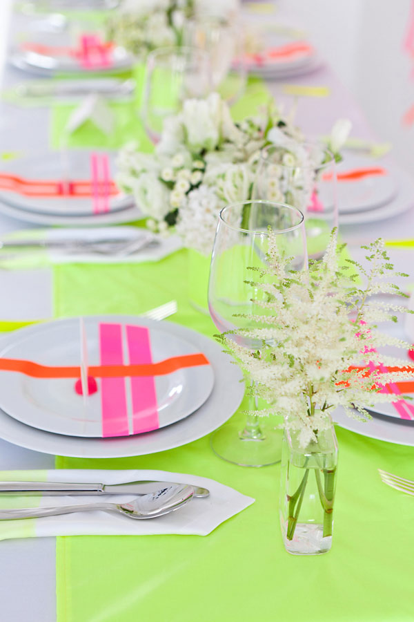
With neon being everywhere for the past year or so, we can’t escape the trend no matter how hard we try. So we can only do the best of it and use it in chic, bold ways. Like have a neon color palette for decorating a wedding. Sounds insane, right? Not if you set limits and decorate with neon within them. Then you can achieve a fashionable and very cool look that will wow everyone. Here’s a table setting to inspire you if you plan a wedding/shower/birthday party anytime soon:
Archive | Color+Inspiration RSS feed for this section
Simple color palette
Sometimes you just need natural colors in your life, right? I’m having some kind of color fevers – one day I’m head over heels for bright palettes, other days I crave simple shades of black, white, gray. I’m guessing it’s a normal thing, people change, as well as their styles and aesthetics. Does this happen to you (because it happens to me quite regularly)?
Sunny yellow
Well, guess what – the awful weather we have here (and which seems to last forever!) has me dreaming about sunny yellows that just pop out and make any day look better. So I’m indulging today in pretty pictures where the focus is on yellow (but of course!).

Living through colors
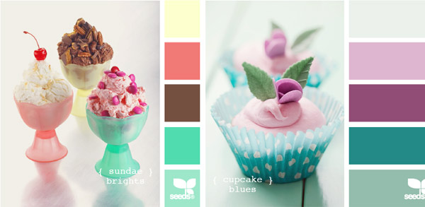
With these shiny, warm days all I have on my mind are colors, colors, colors! It was never a secret I’m totally obsessed with them, but there’s something special happening to me when it’s spring outside – then yellow, blue, red or green gets so much more weight and it’s like life wouldn’t exist without them, you know what I mean? So when I need a dose of bright hues, I head over Design Seeds and of course you know this brilliant site full of inspiration. Here are my highlights for today.
Spring greens and blues
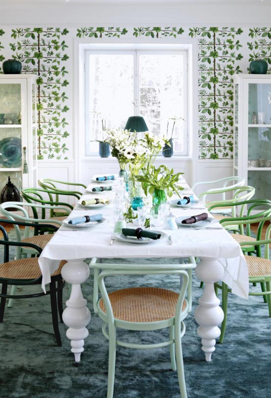
With the spring being here, I can’t help but be inspired by its freshness and brightness. Spring’s green color is my absolute favorite shade and the blue – well, it always feels airy and clean, so this combo is a perfect addition to anything especially after a dreary winter. That’s why I was so smitten by this table setting and the room itself – I could feel the smell of spring through the pictures!
Coral & mint kind of week
Happy Monday, sweets! It’s a real spring here and I couldn’t be more thrilled to have so much sun and warm temperatures – I missed this SO much! And that’s why I’m utterly inspired by a color combination now – coral and mint! Truth is I always loved it, but the pastel shades of these two feel so feminine and modern now that I couldn’t resist but share my obsession with you. I found a pretty nursery decorated with mint and coral, take a look and tell me – what’s your favorite color combo this season?
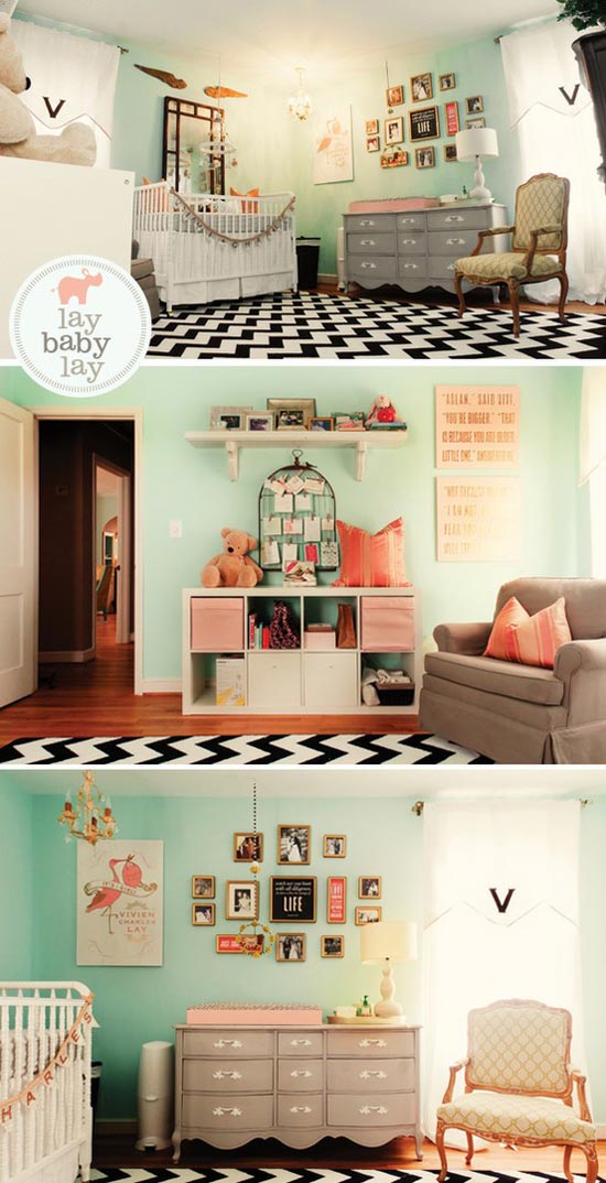
I can’t get enough of coral and mint! And don’t even make me start on the fashion side of the two colors :)
*images via lay baby lay
Color+Inspiration: Crayola Taupe
I have the feeling that even though tangerine was named the color of 2012 we’ll be seeing a lot of nude and I’m pretty sure taupe will be among the trendsetters this season. And not every taupe nuance, but crayola taupe which is close the Chanel Particuliere, you know the nail polish? It’s just as soothing as pale pink/peach is (less feminine perhaps), but it’s so much more modern in my opinion – I guess I’ve seen a lot of soft pales lately. Earthy colors will always be a good alternative to any color, so while we’re at backups, let’s make the best of them! Yay for taupe!
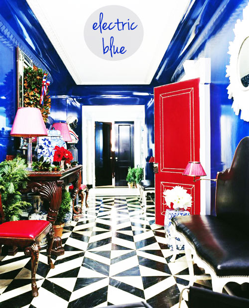
On my mind: Electric blue
That’s one more of my color addictions. I hear everywhere people speaking about winter blues – for me it’s the electric blue that rocks this season because: a. its brightness makes me think of summer; b. it sounds cooler. Yes, it’s that simple. I love it how well electric blue looks in fashion industry too – it’s a statement color all around. But I guess it takes courage to use it, especially in home decor as its striking hue can look really bright and the question is: do you have the guts to commit to such a color?
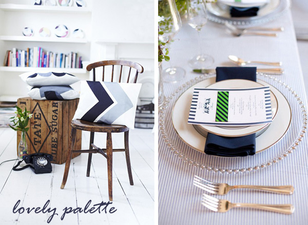
Lovely palette: navy-white-green
It’s finally Friday, friends! But for me it’s more than that – it’s also Christmas eve today and Christmas celebration tomorrow. Yes, might look to you we’re like living on another Planet, but that’s how it is – our Christmas is in January (cool kids like me celebrate it on December 25th and January 7th, so all is well).
How did your 2012 start off? Have you put your resolutions on paper yet? I haven’t, but I have only two or three, so there’s not much need for me to do it.
On another note, the two images below kept popping out all day today so I just couldn’t ignore how refreshing the color palette is: navy, white and green – totally gorgeous, feels like a breath of fresh air.
Enjoy the weekend!
*images 1 via decor8, 2 via style me pretty, both found via pinterest
Color report: Tangerine Tango
You probably all heard that Pantone named the color of 2012 Tangerine Tango. Just like its last year’s sister – honeysuckle – tangerine is a rich, bright hue which leaves a big impact on a room if used right. Accessories, a wall, a rug or a sofa will bring a cheery vibe into your home, tangerine will simply make your space warmer, happier, more modern and home-y. Of course, tangerine will be equally often used in fashion industry (I think the trend was clearly seen already in 2011, right?). Lipstick, nail polish, silky dresses – all tangerine colored will definitely make for a bright year!

Welcome
Ludmila Crigan-Mihajlovic is the founder and editor of this blog, bringing you daily bits of inspiration whether it's about interior design, decor, colors or ideas which lead to a creative living. Enjoy reading!
Follow me on Pinterest


-
 CSN Stores $40 Gift Certificate Giveaway
-
 Baby, baby {big news!}
-
 GIVEAWAY ALERT!
-
 Our magical wedding
-
 What home means to me – Pin it forward
-
Chichi Furniture: Wow, love the stairs and agree with you - it suits...
-
Ivana Marinković Mandić: So glad that you love it! :) Thanks for sharing an...
-
Elizabeth @ Rosalilium: Hi! I'm looking for the original photographer a...
-
Allie: What colors are these exactly and where can I find...
-
Paige: PLEASE tell me where the bedding is from!...
Copyright
All written content and pictures seen on creamylife are property of creamylife unless otherwise noted. Feel free to borrow, but always link back.
