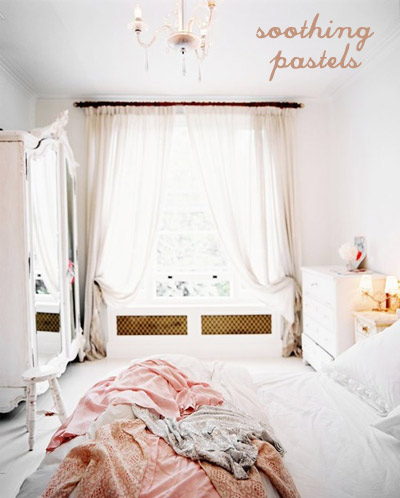
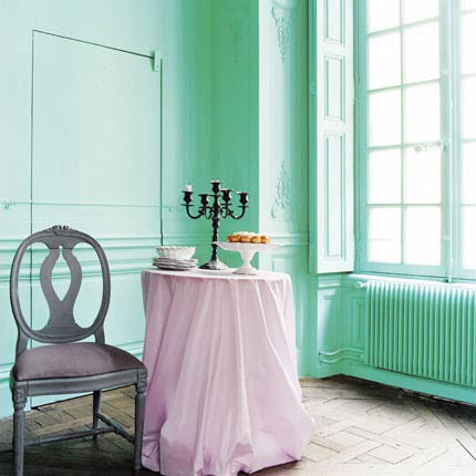
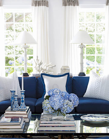
Running my street style photo blog for a few months now allowed me see some tendencies, color choices which are often used and some trends. And yes, we’re speaking about fashion when mentioning my site, but I figured that the same (or at least similar) principles apply to interior design, no? If to recall photography that caught my attention, made me gasp, left me uber inspired – yes, we’re speaking about pastel colors brought indoors, emanating soothing vibes, relaxing and tempting us. Here are some pictures for a color+inspiration post:
Color+Inspiration: White, Black & Camel
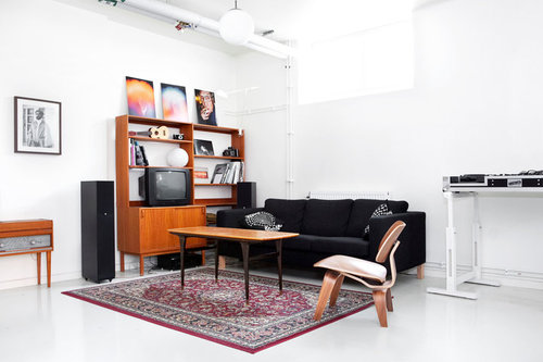
Hello, my friends! We’re on half way to weekend, so get excited, we’re almost there! Yesterday while flipping through my brand new and first issue of Norwegian Elle Interior I came across a picture which had me enlightened. How didn’t I think before about black, white and camel color combination? I mean in my book these three colors are the image of modern, stylish yet warm and cozy interiors! Just feels this way! A timeless inspiring look of a black and white space is undoubtedly the chicest thing ever, but when these two are accompanied by a natural, indeed a warm shade (and don’t get me started on how trendy camel is this season, both in fashion and interior design!) you know that you did GOOD!
Color+Inspiration: Aqua+Orange
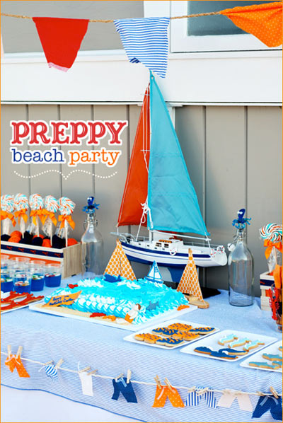
This post is inspired by the blog makeover of Will! No kidding. I love that place for its content and for the awesome blogger behind it. If you don’t know it yet, you definitely don’t live on our planet! Back to Will’s blog, recently it got a face lift and it looks even more fabulous! The colors that have been used are aqua & orange and I just couldn’t walk away without noticing how delicious this combo looks! So I thought that it deserves a color+inspiration post, but then you’ll be surprised again, because it’s not the traditional c+i post, it’s inspired by an adorable party theme, thrown for a 7-years-old boy. You get the point, right?
Color+Inspiration: Coral+Green
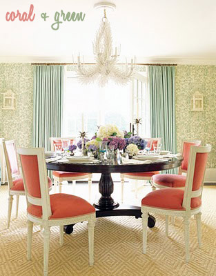
And we met again, my friends! After yesterday’s news I understood even better how important is to have you all and how much your support means to me, I can only be eternally grateful for all the tweets on Twitter and comments and thank God I’m blessed to have so amazing readers! On another note, today on creamylife’s Facebook page I posted this picture which inspired me to write my today’s post, asking if you can guess what is it about. And I got suggestions, though nobody guessed that I was smitten by the lovely, live color combo on the package which afterward guided me to put together this color+inspiration post. So now I’m absolutely in love with coral and green in all their shades (from pinky to peachy coral to mint, apple to pale green – no limits!) and if the below pictures feel too chaotically chosen, think better about the abundance of color ideas you can get!
Color+Inspiration: Rainbow
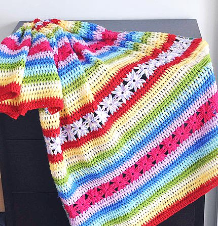
You know how big is my obsession with colors, don’t you? My color+inspiration category makes me happy whenever I take a look at it, so today I put together another post related to it. Only that today, not one color is involved, but more of them and let’s just call this color rainbow (yes, the seven colors of it can work great if used all together and will be as if they’re only one color)! Plus, we all seek joyful shades of the color spectrum to complete our summer-y feeling and what other than the rainbow will do this job the best?
Color+Inspiration: Blue+Brown
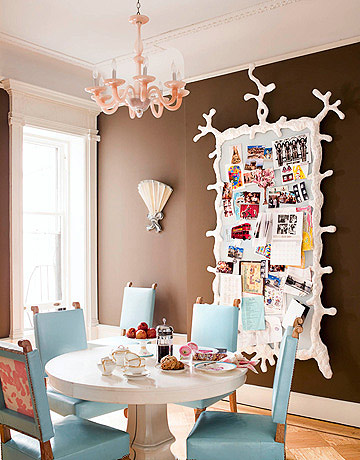
I have prepared another color+inspiration post and this time I’ll be focusing on the combo of a bright/light blue and a chocolate brown. And while I’m still loving the elegance and natural look of the brown, I just couldn’t forget about my love affair with blue (or turquoise) as I think these two colors work together so well, able to create a stylish color balance, being quite charming, don’t you agree? The blue brightens up the dark brown gorgeousness in a space and I would consider decorating my living or dining room with these two shades! Here’s some inspiration:
Color+Inspiration: Dusty Rose
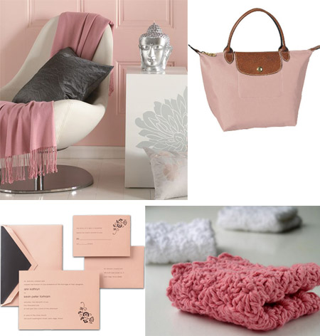
Lately, I’ve seen lots of dusty rose-inspired posts in blogland, so I thought I should give it a try! As I could see, dusty rose is becoming more and more popular, so if you aren’t a big lover of the color – become one asap, because it actually is a softer, muted tone of the pink, which can evoke elegance and style. Don’t know if I like this color when it’s on the wall though, might be looking a bit dirty, but I definitely love it in accessories. Here’s some inspiration:
Color+Inspiration: Chartreuse
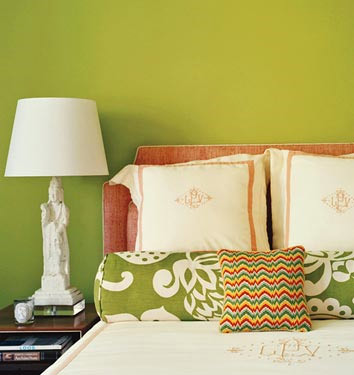
I prepared one more color inspiration post and this time it’s about chartreuse! This is the color we get when mixing the same amounts of green and yellow, so you understand that if adding more green we get a bright chartreuse and if we add more yellow – we get yellow chartreuse! But these shades are far away from being the only variations of chartreuse, I was surprised to find out that apple green, olive green, yellow green and more are also variations of chartreuse! I found some inspirational pictures and please, don’t be amazed the variety of colors you’ll see – they’re all meeting the title of this post: chartreuse! Enjoy!
P.S. I also prepared a chartreuse color palette with some of the variations (there are more!). I hope it will help you define the color :)
Color+Inspiration: Seafoam Green
Finally a ‘color inspiration’ post! These days I’m dreaming about a seaside getaway. With all the rain we’ve had the last few days – a spontaneous trip to the sea would be great! Thinking of all those refreshing, breezy colors sounds dreamy while being stuck in a city! But enough about the awful weather, let’s think of the seafoam green color, shall we? This color it’s such a fresh twist to any interior, isn’t it? When combined with deeper shades seafoam green creates the feeling of sophistication and style, unlike the mix of seafoam green and light colors – what a clean and refreshing look!
Color+Inspiration: Navy blue+White
I’m loving today the beautiful color mix navy blue & white and what’s not to love here? It’s elegant, deep and it creates the feeling of freshness in a room. The white has the role of a brightener while the navy blue is the focal point in the room. I even read that the dark blue or navy blue means unity and stability – what else do we need for our homes? A crisp and neat feeling for your home will be best provided by navy blue combined with white. If you need some inspiration, here it is:

