Color+Inspiration, Inspiration, Interior Design |
01. Jul, 2013
by Ludmila |
Hi all, I have been missing for a very long while and I apologize (again!), but thanks to sweet readers who sent me emails asking if everything’s ok and showing concern, I appreciate it a lot! Yes, everything’s fine, life is busy and I must learn to organize better in order to manage blogging just as I did before. Promise to do my best to stick around this time :)!
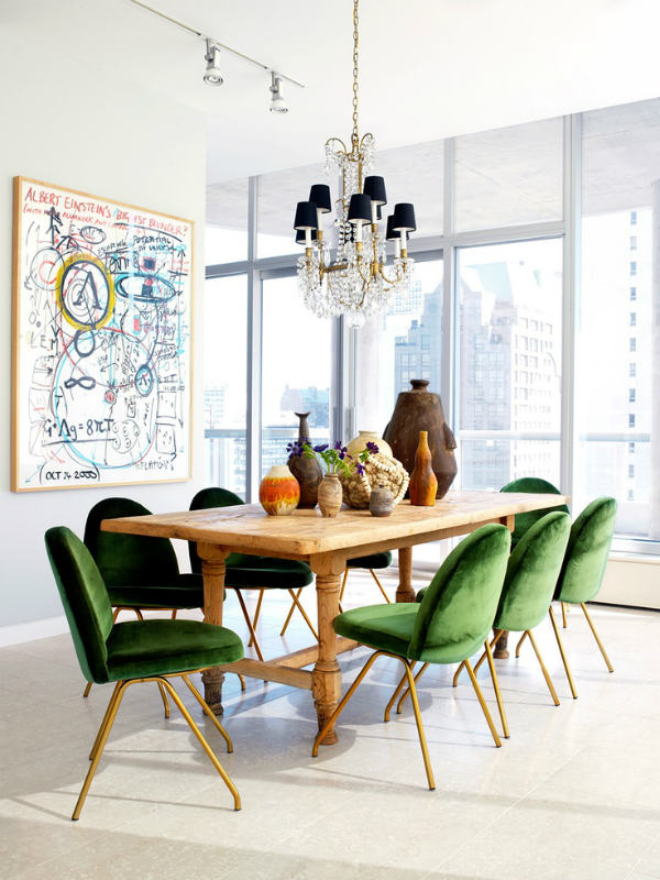
Let’s talk business now :). With emerald green being this year’s color I can’t help but get back to all shades of green over and over again and this collection is particularly appealing as each space is simple, but the green accents are the cherry on the cake providing that needed dose of grandeur and elegance. Also, these rooms have the home-y feeling therefore they’re going to my bookmarks asap!
Have a great week!
 (continue reading)
Tags: color of 2013, decor inspiration, emerald green, green, home decor, Interior Design, Nate Berkus
Color+Inspiration, Inspiration, Interior Design |
03. Apr, 2013
by Ludmila |
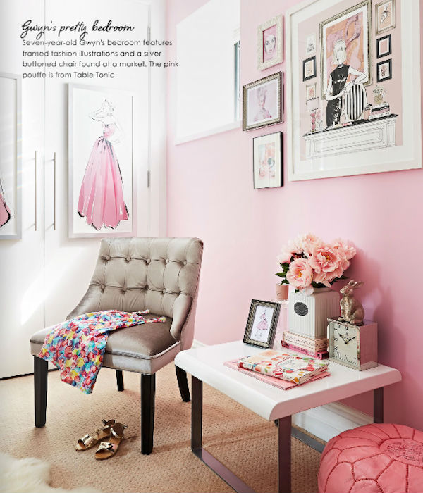
Lately I’m feeling so attracted by simple color schemes which obviously lead up to pretty color coordinated rooms. I enjoy seeing how people use one color (or a combo) throughout an entire room as it adds such a delicate touch and the room feels very neat and chic. Depending on which color you’re going with the room can become feminine, cozy or plain modern. Whatever the result is it’s clear that a color coordinated room looks also very organized and all this together is a winning combination :). Here are a few examples:
 (continue reading)
Tags: color coordinated rooms, color coordination, color inspiration, colors, home decor, inspiration, Interior Design
Color+Inspiration, Fashion, Inspiration, Interior Design |
26. Mar, 2013
by Ludmila |
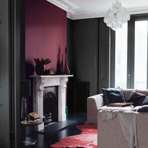
Burgundy was all over fashion this past fall and if you’re following the trends you have at least one piece in burgundy. And it got me thinking how does this color embracing interior design – to my surprise burgundy isn’t very popular in home decor, but I can’t say I don’t understand why, after all this is a bold hue requiring attention when creating color palettes as not every color pairs nicely with burgundy, don’t you think so? Personally I doubt I would paint my bedroom in burgundy as I would probably fear the darkness the room will receive, however accent pieces look pretty good adding a touch of elegance (a result close to what plum gives to a space – royal and sophisticated).
What’s your opinion on burgundy?
 (continue reading)
Tags: burgundy, burgundy inspiration, color, color inspiration, fashion, inpiration, Interior Design, trends
Color+Inspiration, Fashion, Inspiration, Interior Design |
20. Dec, 2012
by Ludmila |
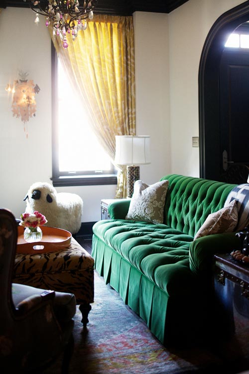
So in one of my last posts I said I’ll be posting every day and I failed at that, but in my defense I can say that I had a reason – a fussy baby (enough said, right?). Anyway, today I’d like to add my two cents to the topic of Pantone choosing Emerald green as the color of 2013. I already expressed my affection for this color in previous posts having no clue that this color will have such a big impact on the design scene at some point – I guess I have foreseen a trend without even knowing it :). The richness of this shade is mesmerizing, showing a whole new level of green – a dense hue that screams refinement and elegance. I like how modern emerald green feels, definitely not the boring green one might expect :).
 (continue reading)
Tags: color of 2013, emerald color, emerald green, emerald green inspiration, fashion, inspiration, Interior Design, Pantone
Color+Inspiration, Inspiration, Interior Design |
27. Aug, 2012
by Ludmila |
Happy Monday, friends! I’m back from my vacation which was absolutely fabulous – short, but sweet :). How was your weekend?
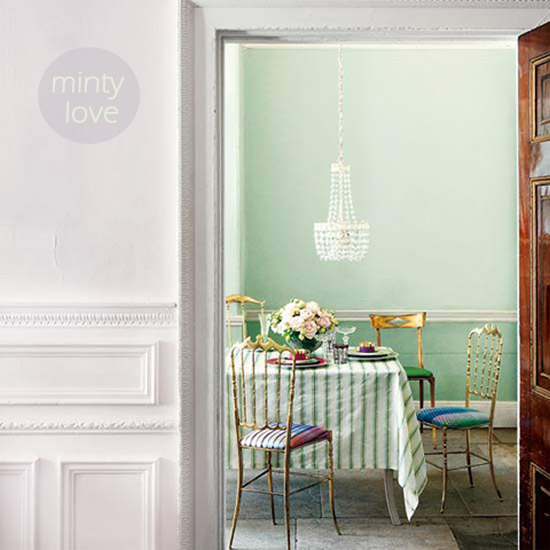
I know how hard Monday can be, so in hopes of making it easier for all of us, I have a refreshing post today – it’s a minty approach to interior design. I’ve written about my obsession for mint here, but what can I do – it just won’t let me go :). Especially since mint is now seen as a pastel color and we know how ‘in’ pastels are at the moment. Minty stripes, accent walls or kitchen cabinets – it’s all beyond chic and refreshing – like a cool breeze on a hot summer day :)
 (continue reading)
Tags: color inspiration, home decor, Interior Design, mint, mint inspiration, pastel decorating
Color+Inspiration, Fashion, Inspiration, Interior Design |
22. Aug, 2012
by Ludmila |
I’m mesmerized by how well the combination of pink and neon yellow works both in home decor and fashion! I mean not that I’m surprised, fashion-wise this is a match made in heaven, but who knew that these two modern and so bright colors will perfectly blend in interior design? This post pretty much proved it to me a while back though – let’s just say it struck me harder today :). I’m in love with unexpected color combos and at this point neon yellow and pink is on top of my favorites. What’s your fave color combo at the moment?
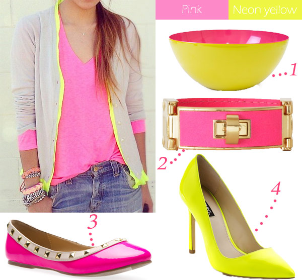
The pumps are gorgeous too, but check how insanely good-looking is that Jonathan Adler serving bowl? Don’t think it can get any better. Or it can – neon yellow bed and a hot pink bedding? Pretty awesome:
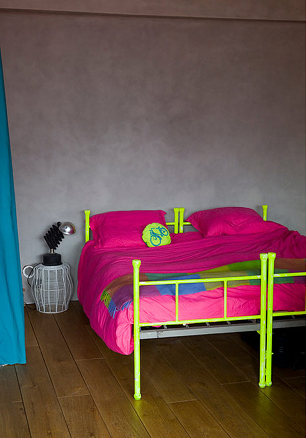
I’m sold, now just to convince the husband about how cool would we be if we paint our room in pink and add punches of neon yellow :). I better forget about it.
Tags: color inspiration, fashion, home decor, Interior Design, neon yellow, neon yellow and pink color inspiration, Pink
Color+Inspiration, Inspiration, Interior Design |
14. Aug, 2012
by Ludmila |
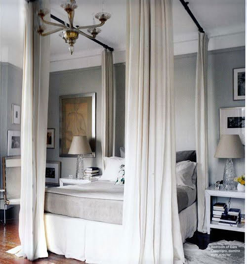
While browsing some inspirational images the other day, I couldn’t ignore the abundance of gray bedrooms out there. Different shades, styles and decors, but one thing in common – timeless gray walls and/or accessories. How I feel about this? Very 2010, but that’s only my opinion – I’m more into pastels/white at this moment in my life. Yes, I like gray bedrooms and probably at some point I would totally paint mine in a gray-ish color, for now let’s just indulge in some pictures and pin what we like – you know, just in case we need ideas in the future :).
 (continue reading)
Tags: Bedroom Inspiration, color inspiration, gray bedrooms, gray color, home decor, inspiration, Interior Design
Color+Inspiration, Inspiration, Interior Design, Kid's Room |
24. Jul, 2012
by Ludmila |
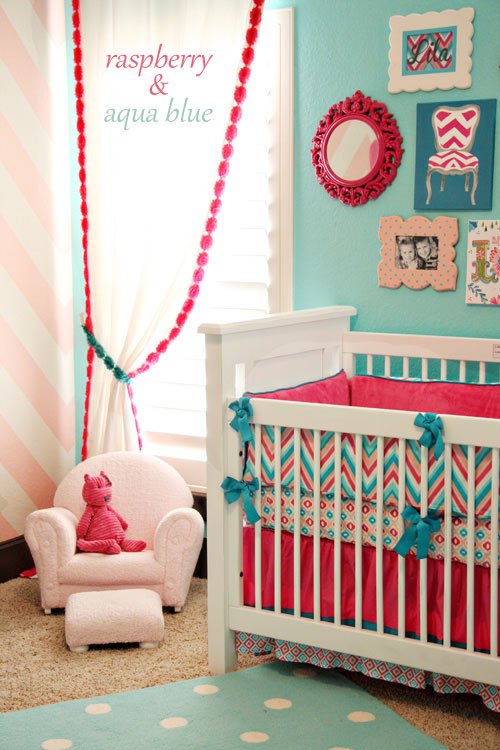
You know I’m a sucker for bright colors, don’t you? I can’t help myself when I see a good color duo done right, especially when it’s a nursery we’re speaking about (is there anything cuter than a stylish kid’s room?). So perhaps you’ve seen this one already, but I’ll anyway take the chance and share it with you. Done is raspberry and aqua blue, with an accent chevron wall this baby room feels airy and just perfect for a happy girl (not so sure about how would a little guy react when seeing pinks and reds ha!).
 (continue reading)
Tags: baby room, color inspiration, inspiration, Interior Design, Kid's Room, nursery, raspberry blue nursery
Color+Inspiration, Inspiration, Interior Design |
29. Jun, 2012
by Ludmila |
Happy Friday, friends! We made it and there are just a few hours left until the weekend we’re all waiting for (finally some relaxation time, right?). So to honor this glorious day, I’m loving green – a glorious color that’s timeless, modern and beyond refreshing in an interior! I’m especially drawn to kelly green, but all the other shades are pretty cool too and they look great in any room – kitchen, living room, entryway (proof below):
 (continue reading)
Tags: color inspiration, green, green color, green inspiration, home decor, Interior Design
Color+Inspiration, Inspiration |
27. Jun, 2012
by Ludmila |
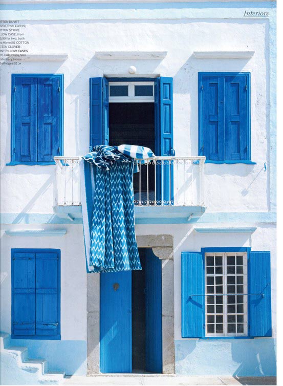
Vacation season is approaching and some inspiration in its spirit sounds perfect, right? Greece is a dream destination for all mainly because of its gorgeous beaches and the islands that are worth your visit. Speaking for myself, not the last reason for visiting Greece is the architecture and the stunning colors that just scream sea, breezy air and total relaxation – white and blue.
 (continue reading)
Tags: architecture, blue, color inspiration, Greece, inspiration, white, white and blue inspiration