Color+Inspiration, Inspiration, Interior Design |
15. Jun, 2010
by Ludmila |
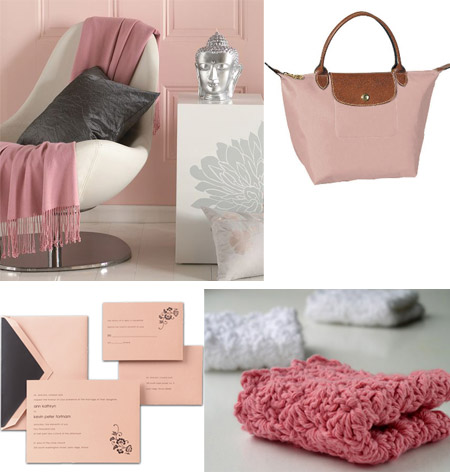
Lately, I’ve seen lots of dusty rose-inspired posts in blogland, so I thought I should give it a try! As I could see, dusty rose is becoming more and more popular, so if you aren’t a big lover of the color – become one asap, because it actually is a softer, muted tone of the pink, which can evoke elegance and style. Don’t know if I like this color when it’s on the wall though, might be looking a bit dirty, but I definitely love it in accessories. Here’s some inspiration:

(continue reading)
Tags: color+inspiration, Color+Inspiration: Dusty Rose, dusty rose inspiration
Color+Inspiration, Inspiration, Interior Design |
04. Jun, 2010
by Ludmila |
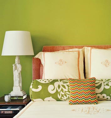
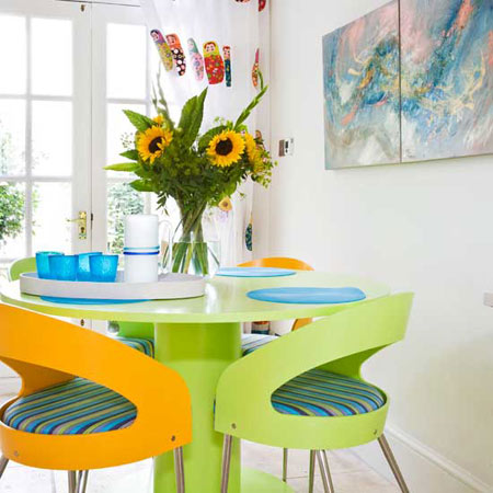
I prepared one more color inspiration post and this time it’s about chartreuse! This is the color we get when mixing the same amounts of green and yellow, so you understand that if adding more green we get a bright chartreuse and if we add more yellow – we get yellow chartreuse! But these shades are far away from being the only variations of chartreuse, I was surprised to find out that apple green, olive green, yellow green and more are also variations of chartreuse! I found some inspirational pictures and please, don’t be amazed the variety of colors you’ll see – they’re all meeting the title of this post: chartreuse! Enjoy!
P.S. I also prepared a chartreuse color palette with some of the variations (there are more!). I hope it will help you define the color :)

(continue reading)
Tags: chartreuse, color+inspiration, Color+Inspiration: Chartreuse
Color+Inspiration, Inspiration, Interior Design |
02. Jun, 2010
by Ludmila |
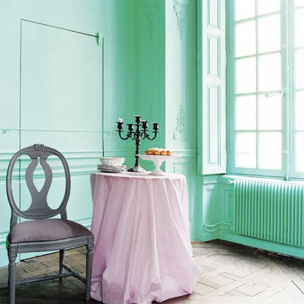
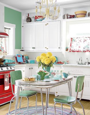
Finally a ‘color inspiration’ post! These days I’m dreaming about a seaside getaway. With all the rain we’ve had the last few days – a spontaneous trip to the sea would be great! Thinking of all those refreshing, breezy colors sounds dreamy while being stuck in a city! But enough about the awful weather, let’s think of the seafoam green color, shall we? This color it’s such a fresh twist to any interior, isn’t it? When combined with deeper shades seafoam green creates the feeling of sophistication and style, unlike the mix of seafoam green and light colors – what a clean and refreshing look!

(continue reading)
Tags: color+inspiration, Color+Inspiration: Seafoam Green, Seafoam Green
Color+Inspiration, Inspiration, Interior Design |
19. May, 2010
by Ludmila |
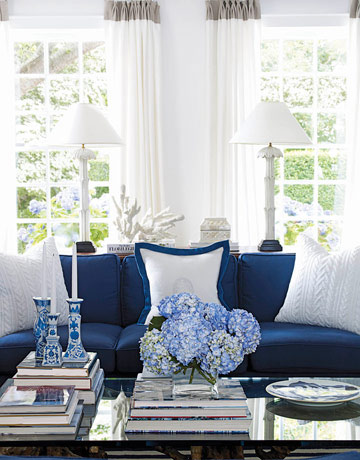
I’m loving today the beautiful color mix navy blue & white and what’s not to love here? It’s elegant, deep and it creates the feeling of freshness in a room. The white has the role of a brightener while the navy blue is the focal point in the room. I even read that the dark blue or navy blue means unity and stability – what else do we need for our homes? A crisp and neat feeling for your home will be best provided by navy blue combined with white. If you need some inspiration, here it is:

(continue reading)
Tags: color+inspiration, navy blue+white, navy blue+white inspiration
Color+Inspiration, Inspiration, Interior Design |
13. May, 2010
by Ludmila |
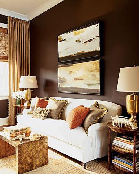
Today I got another crazy idea about a color combo: gold & brown. I said crazy, because again, hard to find inspirational pictures. And believe me I *really* tried. I just like it a lot, it’s warm and cozy and reminds me of things I love: chocolate, luxury (love it maybe a bit) and romantic, comfortable bedroom. But why was so hard to find images? Was it because I just discovered a new color combo that is stunning or because gold & brown can’t go together?! For me this mix of colors it is stunning, I feel warmth whenever I think of it and since I trust my feelings a lot, I’ll dare to think that golden combined with brown isn’t *that* crazy! What do you think?

(continue reading)
Tags: color+inspiration, gold+brown, gold+brown inspiration
Color+Inspiration, Inspiration, Interior Design |
05. May, 2010
by Ludmila |
Hi, dear readers! How have you been? I have a BIG news to share with you before I start blogging! Since today I’m officially a contributor on a Serbian site related to interior design called Enterijer.rs! I’m so honored to be a part of such a talented team working there, I’m really REALLY excited and look forward bringing my design thoughts there! But this doesn’t mean I’ll be blogging less on CreamyLife, no way! After all, this is my first and biggest experience in blogging :).
Alright, back to my post. I must admit I was craving femininity last 2 days: pale pinks and peaches, romantic bedrooms with tulle curtains, warm sun rays – doesn’t this sound fabulous?! It does! However, I’ll blog about something completely different! I’ve seen lots of tangerine lately on the Internet, a bright, joyful color able to cheer up my romantic mood! So I thought I’d give it a try! Here are some inspirational pictures:

(continue reading)
Tags: color+inspiration, tangerine color, tangerine inspiration
Color+Inspiration, Inspiration, Interior Design |
03. May, 2010
by Ludmila |
Oh well, I showed you my new crush and now would be the perfect moment to write about the color that inspires me today and that will be mint color! I’ve seen a lot of mint in blogland lately and I must admit, only looking at the color makes me feel its freshness and the aromatic scent! Being a color between apple green, lime, aqua (and maybe more) mint comes in different shades: mint green, mint gray, mint blue, so I searched for inspirational pictures that are about all these shades (don’t be surprised if you see quite different mint color). Mint also turns to be a calming color, perfect for a kitchen, dining room, nursery – oh well, it’d be great in every room, I guess! I hope you like the inspiration I found:

(continue reading)
Tags: color+inspiration, inspirational pictures, mint color, mint inspiration
Color+Inspiration, Inspiration, Interior Design |
29. Apr, 2010
by Ludmila |
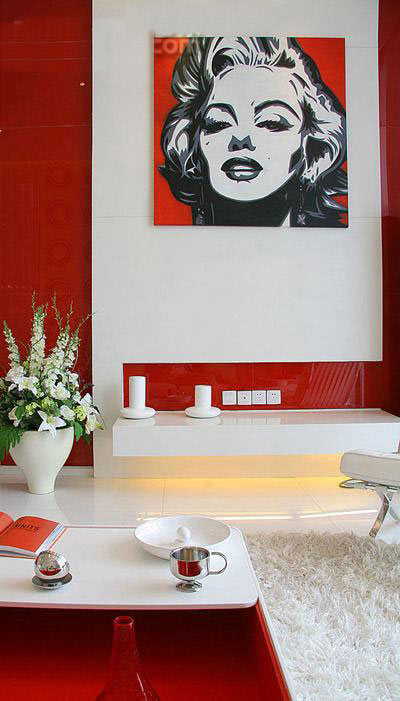
Not much to say about the combination of red and white colors. The passion and light emanated by this combo speaks all by itself! And before red+white rooms seemed to me very fancy and luxurious and they really are, but guess what, I did find cute yet chic pictures of country spaces decorated with white and popping red accessories here and there! I like this idea more rather than painting the living room in red, for example :). That it’d be visually too exhausting. What’s your opinion about white and red? How do you think people should use this combo in their homes?

(continue reading)
Tags: color+inspiration, red+white, red+white inspiration
Color+Inspiration, Inspiration, Interior Design |
27. Apr, 2010
by Ludmila |
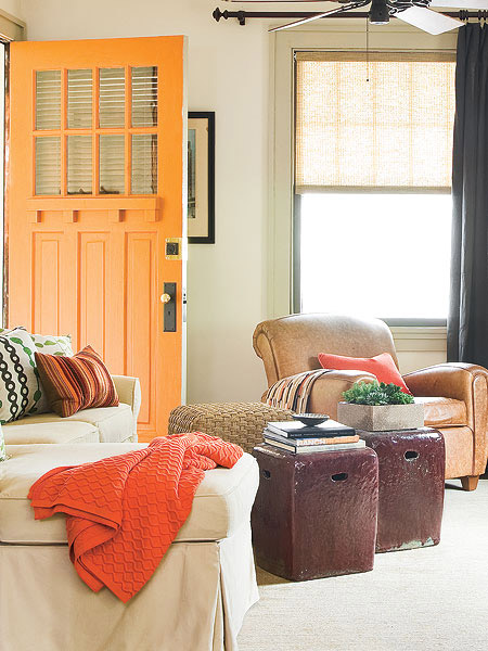
Good morning, lovelies! I’m an early bird today so let’s get to blogging immediately :). The color mix green+orange was suggested to me by my husband! That’s right, yesterday he decided to help a little by telling me some of his favorite combos. Green & orange seemed at first sort of weird – in my vision these colors just didn’t work good together. But then I researched a little, meditated and analyzed and agreed with him! I must admit that green, being a calming color and orange – an energizing one, make a great room balance, borrowing from each other softness and freshness. I even understood the tendency of painting a child’s room in green & orange – calm yet energized, and this sounds just perfect for a kid with healthy lifestyle! And it really isn’t important is it a bright green, lime or apple green – it all works just fine!

(continue reading)
Tags: color+inspiration, green+orange, green+orange inspiration

